Home | Hardware Plan | Hardware | Graphical User Interface | Human Interaction | Design | Reflections
Introduction
As robots designed to be interacted with by humans (social robots) become more prevalent in our daily lives, so too does the importance for these robot's designs to be appealing to the people who use them. This idea is crucial in the design process of Dot, a robot which is intended to autonomously approach people in a variety of contexts and get them to complete a survey. This report will first discuss how the uncanny valley effect must be avoided when designing social robots. It will also go into the various design considerations that must be made regarding a robot's design, focusing on the body and face. Finally, it will review how these design considerations have been applied to Dot's overall design.
Uncanny valley effect
The uncanny valley effect, coined by Masahiro Mori, proposes that as a robot becomes more realistic and human-like, it's appeal and acceptance increase as well (Mori, 1989). However, there comes a point where, as the robot approaches a 1:1 representation of a human it instead becomes increasingly disturbing and its appeal plunges. This is because at best, the robot starts to look almost human - but not quite, and at worst, it will resemble a moving corpse. This effect can be applied to both the robot's overall appearance and the way it moves, with movement generating a stronger response (Blow et al., 2006). In some contexts, this does not have to be a negative quality. In a paper from Cowley et al. (2005), they argue that the uncanny valley effect in robots could be an effective tool in psychological studies, as it implies that people are imposing a strict human model to evaluate them. However, for robots who are primarily designed to interact with people, the uncanny valley effect is something that must be avoided (Tschöpe et al., 2017).
Design considerations for robot bodies
When deciding on the general shape and form factor for a social robot, great care must be taken in making sure that it does not appear intimidating. When designing the humanoid helper robot Pepper, SoftBank Robotics made many design choices to make Pepper look friendly and approachable (Pandey & Gelin, 2018). They designed Pepper with a humanoid appearance, with the intent of avoiding the uncanny valley. The humanoid shape of Pepper was also designed to be gender-neutral, to avoid stereotypes. This also has the effect of people addressing it as him, her, or it in equal measure. Pepper includes two arms to express emotions with. SoftBank also utilized many soft curves, with all of Pepper's torso, head and ligaments being round. They did this to increase the overall safety of Pepper, as sharp edges or corners may lead to injury if someone were to accidentally bump into it. However, this also has the added benefit of making Pepper appear more approachable. Generally-round and soft bodies appear cuter and friendlier to the human brain, which in turn increases Pepper's appeal (Micu, 2018). Height also plays a role in making Pepper more appealing, with it having a height of 1210mm which is approximately the height of a person sitting down in a chair (Pandey & Gelin, 2018).
A similar design philosophy was taken with the design of Care-O-bot 4, from Fraunhofer IPA and Mojin Robotics (Kittmann et al., 2015). The Care-O-bot 4 was designed to fit the persona of a gentleman, with one arm held at a 90-degree angle in front of its torso and the other held behind it at the same angle. Care-O-bot 4's design is slender, with a "small symmetrical footprint." Like Pepper, Care-O-bot 4 is designed to look humanoid, but missing features to ensure that the uncanny valley effect didn't occur. It is designed to look gender-neutral and utilizes many soft curves around its whole body.
Colour is also an important design consideration when designing a robot. Both Care-O-bot 4 and Pepper, as well as many other social robots, have very similar colour schemes: white with black accents (Kittmann et al., 2015; Pandey & Gelin, 2018). The colour white has psychological connotations with integrity, innocence, and purity; all three are important associations to be made with a robot designed to be appealing to people (Przybyla, 2020). There are also benefits to the mono-chromatic minimal colour scheme, not least of which is that it makes the design look clean and simple (Cousins, 2015). Additionally, the black accents immediately draw the user's eyes to the most important bits of the design which, for both and Pepper and Care-O-bot 4, are their screens, which is what the user will be interacting with most of the time. Because the rest of their designs are primarily white, the user will instinctively draw their eyes to the black parts.
While not fundamentally linked to the overall appeal of a robot, the contexts in which it will look visually appropriate are also important to consider. Both Pepper and Care-O-bot 4 are designed in such a way that allow them to be placed in a variety of places without looking out of place (Kittmann et al., 2015; Pandey & Gelin, 2018). Someone could find a Pepper robot operating as a storefront gimmick, at expos, and in healthcare settings, among other places (Love, Pepper, 2019; Pepper at Westfield – Highlight, 2017, 03:15–05:21; _Pepper's Capabilities, 2016). The reasons that these robots look visually appropriate almost anywhere is due to the reasons stated above; their minimal designs mean they will not look out of place.
Design considerations for robot faces
Giving a robot a face is incredibly important for several reasons. A face gives the person attempting to interact with the robot an understood focal point for the interaction and can give visual clues to help a person to understand the robot's general capabilities (Blow et al., 2006). In this sense, designing a robot's face is arguably one of the most important aspects behind a robot's design, as the face on its own can strongly determine a person's perception of the robot as a whole (Blow et al., 2006). Faces allow humans to communicate, attract others, and display or betray emotions, among other things (Blow et al., 2006). In this context, it is very easy to see why humans are so tuned towards faces. Therefore, it is very important that, to be appealing, robot faces must mimic the form of a human face in some way. One way that this can be achieved is through facial expressions. In a 2005 study of people's expectations of a robot companion, most of the participants were in favour of them, particularly if the robot could emulate communication in a human-like manner (Dautenhahn et al., 2005). Non-verbal communication, particularly via facial expressions, is incredibly important to human interaction, and the same is true for robots designed to interact with people (Jack & Schyns, 2015). While it would be cheaper and less strenuous to designate several LEDs on a robot to indicate emotional expressions, the association between the LED's colour and corresponding emotion would have to be learnt and processed. It is far more effective to program a robot to display "emotion" as a facial expression when a user interacts with it in specific ways. A smile, for example, is less ambiguous and has a bigger immediate emotive impact than a green LED flashing to indicate the same feeling (Blow et al., 2006). Emotional expression is necessary for a social robot, and the capability to do this helps to create empathy, and therefore establish a link between the person and the robot they are interacting with (Tapus & Mataric, 2006). Riek et al. (2009) observed that people are more empathetic towards robots who can express human-like emotions than purely mechanical robots.
The design of a face is also important in allowing the robot to appeal to users. People are naturally drawn towards symmetrical faces in terms of physical attraction, so most robot's faces are designed to be symmetrical (Lents, 2019). In a series of surveys from Kalegina et al. (2018) looking at 157 robot faces, they discovered a lot of robot faces tend to share a lot of design similarities. Most of the faces had mouths, but lacked a nose, cheeks, or eyebrows. Only 10% of the robots selected had eyes shaped like humans, circular eyes were far more popular. Selecting a set of 12 from the original 157, the researchers put them on a scale measuring detail and realism. They asked a group of participants to rate them on the following qualities: friendliness, intelligence, trustworthiness, and overall preference. Faces that were relatively detailed but not exceedingly realistic were rated highly in terms of friendliness, trustworthiness, and overall preference. Faces with no pupils and no mouths were considered unfriendly and untrustworthy. The survey then created a controlled set of faces with varying design features, with a baseline designed to be the most "average" face. They asked the participants to rate them on the same scale as before. While no face was rated as being significantly more friendly than the baseline, the faces deemed the least friendly were ones lacking details such as a mouth or pupils, or one that possessed eyelids. Similarly, there was no face deemed significantly more trustworthy than the baseline, and the faces considered the least trustworthy were the same ones regarded as the least friendly. The face deemed the most intelligent was the one that featured eyebrows. The way that the eyebrows were designed meant it avoided a baby-faced look, which would imply naivete and therefore, lower intellect.
Through both surveys, the report indicated that faces with no mouth or no pupils were consistently considered unfriendly, unlikeable, and machine-like (Kalegina et al., 2018). Respondents remarked that these robots gave the impression that they were watching them and were used for surveillance purposes. Multiple respondents noted that the simple faces, ones containing only eyes and a mouth, were the most friendly and trustworthy. This is because they contained both human and machine-like qualities, meaning that while humans were able to relate them, they were still easily distinguishable as robots.
In a paper from Blow et al. (2006) detailing the face designing process for a social robot called KASPAR, several robot faces are assigned, subjectively, to 3 different categories: abstract, realistic, and iconic. They outlined the pros and cons for each. Realistic faces have the benefit of a strong physical presence and can display subtle expressions. However, it is very hard to avoid the uncanny valley and they are expensive to build and maintain. Abstract faces have the benefit of avoiding the uncanny valley outright because they are designed to be less human looking, though they have the disadvantage of users failing to identify with them. The category with the most amount of advantages are iconic faces. They are minimal, simple, robust, easy to make, and avoid the uncanny valley by being small. Their small size also leads into them being cute and non-threatening, which is important when designing a social robot (Micu, 2018). The main disadvantages of them are that they are only capable of displaying a small range of expressions, and that the lack of complexity may lead to users getting bored of them.
How these design considerations apply to Dot
This report will now discuss how the above face and body design considerations have been applied to the final implementation of Dot's own design, as well as how it's design will accommodate the hardware it needs to function. Unfortunately, we were unable to procure a physical version of these designs due to communication issues with the design department, so we were not capable of fully realizing or testing the potence of this design. However, due to the thorough research above, we believe that this design for Dot would have been fully capable of appealing to people.
Body
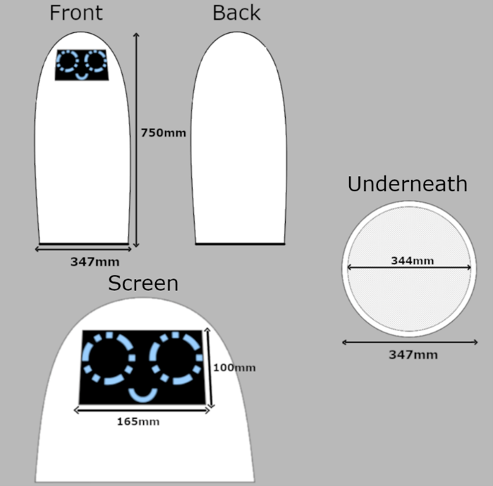
Figure 1: Dot's finalized body design
Dot's body design resembles a vertical oblong-like shape and will stand at 750mm tall. The height was chosen because it meant that the screen (its only method of interaction) will be a convenient distance between it and someone's fingers. This height was also chosen so that there wouldn't be any issues keeping itself balanced. Its base is circular with an outer width of 347mm and inner width of 344mm. The width is designed to accommodate the iRobot Create 2, which is the platform it will use to move around a room. Some form of apparatus to adhere Dot to the platform will be necessary. Dot's body is hollow, which was done to reduce the materials needed in its construction, and also to allow for a cable to connect from the screen to the Raspberry Pi, which would sit near the bottom of its shell. The hollow design is also to ensure a light weight, with the Create 2 having a safe weight limit of 9kg (What Is the Maximum Payload Weight for Create 2/Can I Use Old Create Accessories with the Create 2?, 2014). A rectangular hole measuring 165mm x 100mm would be cut near the top of Dot's shell for the 7" touchscreen to be inserted.
There are several reasons why we believe that this body design will be appealing and encourage people to interact with Dot. Dot's shell is designed to have absolutely no hard edges or corners at all, which ensures that people will be uninjured if people accidentally bump into it. Additionally, as discussed above, soft curves are often associated with cuteness and friendliness in people's minds, which would greatly increase Dot's physical appeal (Micu, 2018). The chosen height also plays a role in this. While 750mm is convenient for the user in terms of interaction, it is also the average height of a 1½ year old child (Average Child Height, 2017). This makes sure that Dot will not be intimidating for a user. While Dot's general shape resembles an abstract form, there is a slight curvature running down from the tip to the base. This gives Dot a subtle resemblance to the human form, while staying very far away from falling into the uncanny valley. Another key benefit of this design is that it greatly increases the number of contexts in which Dot will look visually appropriate. While Dot's main purpose is to get people to fill out a survey, the minimal and appealing design of Dot means that it could be used in similar applications to Pepper.
Dot features a minimal colour scheme, being almost entirely white. The only other colour, black, is used for the screen. Glossy plastic would be used as the construction material. These design choices have several key benefits in increasing Dot's visual appeal. The minimal colour scheme will draw people's eyes to Dot's screen, which is how they will interact with it (Cousins, 2015). White also draws mental connections to purity and innocence (Przybyla, 2020). The use of glossy plastic will help in terms of attracting people to Dot, as glossy objects are mentally correlated with higher quality (Why Are People Attracted To Shiny Objects?, 2019).
Face
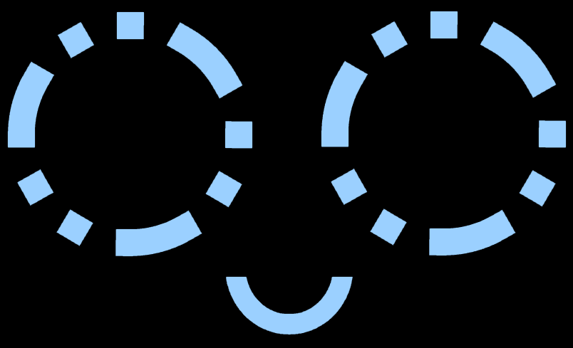
Figure 2: Dot's neutral expression
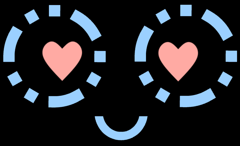
Figure 3: Dot's happy expression

Figure 4: Dot's distressed expression
The face for Dot is 804 x 849 pixels and is designed to fit on 7" touchscreen. This touchscreen is Dot's method for interactivity between it and the user, with the interaction being when a person taps on its screen, they will be prompted with a questionnaire to fill out. Dot will be able to express three different emotions based on its current state. Its neutral expression (figure 2) will be active whenever it is moving around, looking for a person to fill out its questionnaire. The happy expression (figure 3) will occur when said person has filled out its survey. The distressed expression (figure 4) will occur if Dot gets stuck trying to move around. While the mostly black screen serves no purpose aside from design, if we were to switch to an OLED/AMOLED screen at some point it would help in the conservation of battery life.
We believe that this the face design will be appealing for several reasons. First and foremost, it clearly indicates to a person interacting with Dot where its point of interactivity is (Blow et al., 2006). The various facial expressions also allow Dot to communicate with its user via non-verbal means, and also allow a user to identify with Dot, enabling an empathic connection (Riek et al., 2009) The overall design for the face was influenced by the findings of Kalegina et al. (2018), where they discovered that robot faces that resembled a human's were correlated with feelings of friendliness and trustworthiness, so long as they didn't become so detailed that they fell into the uncanny valley. As such, Dot's face generally resembles a human's, but does not come anywhere close to a realistic representation of one, thus avoiding the uncanny valley while also being visually appealing. This also has the added benefit of increasing the overall friendliness of Dot, as features such as eyebrows or eyelids generally make people feel that a robot is untrustworthy and unfriendly.
References
Average Child Height. (2017). OnAverage. https://www.onaverage.co.uk/body-averages/average-child-height.
Blow, M., Dautenhahn, K., Appleby, A., Nehaniv, C. L., & Lee, D. (2006). The art of designing robot faces. Proceeding of the 1st ACM SIGCHI/SIGART Conference on Human-Robot Interaction - HRI '06. https://doi.org/10.1145/1121241.1121301
Cowley, S. J., Ishiguro, H., MacDorman, K., Minato, T., Shimada, M., & Itakuru, S. (2005). Assessing human likeness by eye contact in an android test bed. XXVII Annual Conference Cognitive Science Society. https://www.academia.edu/2922177/Assessing_human_likeness_by_eye_contact_in_an_android_test_bed
Cousins, C. (2015, June 15). Minimalist Design Is Taking Over: Here's Why. Design Shack. https://designshack.net/articles/layouts/minimalist-design-is-taking-over-heres-why/
Dautenhahn, K., Woods, S., Kaouri, C., Walters, M. L., Kheng Lee Koay, & Werry, I. (2005). What is a robot companion - friend, assistant or butler? 2005 IEEE/RSJ International Conference on Intelligent Robots and Systems, 1488–1493. https://doi.org/10.1109/iros.2005.1545189
Jack, R. E., & Schyns, P. G. (2015). The Human Face as a Dynamic Tool for Social Communication. Current Biology, 25(14), R621–R634. https://doi.org/10.1016/j.cub.2015.05.052
Kalegina, A., Schroeder, G., Allchin, A., Berlin, K., & Cakmak, M. (2018). Characterizing the Design Space of Rendered Robot Faces. Proceedings of the 2018 ACM/IEEE International Conference on Human-Robot Interaction, 96–104. https://doi.org/10.1145/3171221.3171286
Kittmann, R., Fröhlich, T., Schäfer, J., Reiser, U., Weißhardt, F., Haug, A., Diefenbach, S., Henze, N., & Pielot, M. (2015). Let me Introduce Myself: I am Care-O-bot 4, a Gentleman Robot. Mensch Und Computer 2015 – Tagungsband, 223–232. https://doi.org/10.1515/9783110443929-024
Lents, N. H. (2019, July 8). Why Are Symmetrical Faces So Attractive? Psychology Today. https://www.psychologytoday.com/nz/blog/beastly-behavior/201907/why-are-symmetrical-faces-so-attractive
Love, Pepper. (2019, February 13). [Video]. YouTube. https://www.youtube.com/watch?v=MrRISDDZy_0
Micu, A. (2018, November 7). What makes things cute? ZME Science. https://www.zmescience.com/science/cute-things-feature/
Mori, M. (1989). The Buddha in the Robot (Original ed.). Kosei Publishing Company.
Pandey, A. K., & Gelin, R. (2018). A Mass-Produced Sociable Humanoid Robot: Pepper: The First Machine of Its Kind. IEEE Robotics & Automation Magazine, 25(3), 40–48. https://doi.org/10.1109/mra.2018.2833157
Pepper at Westfield – Highlight. (2017, May 19). [Video]. YouTube. https://www.youtube.com/watch?v=kITYejMbAZs
| _Pepper's Capabilities | Pepper at AT&T SHAPE Tech Expo | SoftBank Robotics Video_. (2016, August 19). [Video]. YouTube. https://www.youtube.com/watch?v=z57RnaMPwJc |
Przybyla, D. (2020, September 9). White Color Psychology and Meaning. Color Psychology. https://www.colorpsychology.org/white/
Riek, L. D., Rabinowitch, T.-C., Chakrabarti, B., & Robinson, P. (2009). How anthropomorphism affects empathy toward robots. Proceedings of the 4th ACM/IEEE International Conference on Human Robot Interaction - HRI '09, 245–246. https://doi.org/10.1145/1514095.1514158
Tapus, A. & Mataric, M. (2006). Emulating Empathy in Socially Assistive Robotics. Retrieved 2020, November 11 from http://robotics.usc.edu/publications/media/uploads/pubs/533.pdf
Tschöpe, N., Reiser, J. E., & Oehl, M. (2017). Exploring the Uncanny Valley Effect in Social Robotics. Proceedings of the Companion of the 2017 ACM/IEEE International Conference on Human-Robot Interaction. https://doi.org/10.1145/3029798.3038319
What is the maximum payload weight for create 2/can I use old create accessories with the Create 2? (2014, December 10). [Robotics Stack Exchange post]. Robotics Stack Exchange. https://robotics.stackexchange.com/questions/5132/what-is-the-maximum-payload-weight-for-create-2-can-i-use-old-create-accessories/5136#5136
Why Are People Attracted To Shiny Objects? (2019, June 12). Discovery Zone. http://www.discovery-zone.com/why-are-people-attracted-to-shiny-objects/